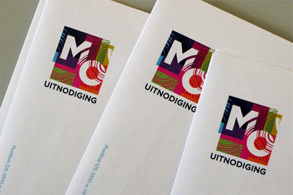
A fresh new start is accompanied by a new look from the inside out. Over the last months the Metropole Orkest worked intensively on a new style and new website, and it is now official! Our alert fans may have already noticed some pictures with circles and sound waves on them. Designer Martin Pyper of ME Studio explains:
“I was thrilled that an organization like the Metropole Orkest asked me to think about their new identity. When I design something, music is my biggest source of inspiration, so what more could I ask for than to design for the Metropole Orkest! The MO has a long proud history, but also a clear vision for the future which generates many emotions. To find out what these emotions are exactly and delineating them step by step is a very moving and inspiring process. The created identity is built of coloured blocks and circles. The circles can be viewed as an expression of sound waves—a physical metaphor that represents over-flowing layers of sound constantly creating a new pattern or composition. Then one can use the dynamic of the lines in several ways in the design.
The coloured blocks express the diversity of the repertoire—pop, jazz, classical, and many other genres. The variety and juxtaposition of the colours symbolize the diversity and liveliness of ‘the product.’ A rainbow of colours also allows for different design applications in the future. Colour generates emotional response. The new coloured pillars in the MO office create a brisk vibe of energy. A bank for example, wants to show stability and reliability, and often uses the colour blue. An orchestra on the other hand, stands for creativity and vitality therefore coloured objects are a better fit. Why choose one style when you can have more? Curious for more designs? click here


and contribute to educational projects and the preservation of Dutch heritage.